Disparity & Outcome Scatterplot
Racial disparity is pervasive across California and it impacts all of us. See the full picture across counties, issue areas, and indicators.


Why view data on a scatterplot?
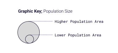
Viewing data on the scatterplot allows you to see disparities, outcomes, and impact all in one chart. You can use this chart to identify outliers – communities with much better or worse disparities or outcomes. For example, a bubble to the far right of the chart indicates a much higher than average disparity and a bubble towards the top of the chart represents a much better than average overall outcome. The size of each bubble, based on population, indicates the number of people impacted.

How is my community doing?
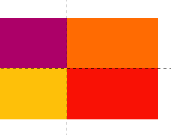
We assign communities to one of four categories based on how well they are doing on racial disparity and overall outcomes compared to the average. Communities with better than average outcomes and higher than average racial disparity are in the ‘Prosperity for the Few’ category. These communities will appear orange on maps, tables, and scatterplots. For example, if your community falls in this category for high school graduation, your community’s overall graduation rate is on the higher end, but students in some groups are substantially less likely to graduate than others.
Communities with lower outcomes and lower disparity are placed in the ‘Struggling to Prosper’ category and will appear yellow. In these places, systems are producing worse outcomes for most residents. As RACE COUNTS calculations are based on comparison to the average, it is important to note that even when a place is doing better than others, disparities still exist and there is always room to improve outcomes.
When a community has larger disparities and worse overall outcomes than the average, it is placed in the ‘Stuck and Unequal’ category and will appear red. Communities with higher outcomes and lower disparity fall in the ‘Gains at Risk’ category and will appear purple. in these places systems are producing better outcomes for most residents.
Disparity & Outcome Scatterplot
A visual snapshot of racial disparity, outcomes, and impact across seven key issues.
All Issues:
All Indicators

Put Data to Use
Learn how you can take action to eliminate racial disparity and use RACE COUNTS data to advance social justice.
Take Action